intrepid wrote:Like the third dimension? ...back to the future?holddown wrote:... as far as the spreadsheet goes, I'm planning on taking it to a whole new level.
Here we go...
I now have five full years of information in my surf journal in a Word document that has grown to 147 pages. The daily entries range from detailed descriptions of conditions, waves, unusual events, and photos to something as simple as "surfed twice".
I had fallen behind in the tabulation of data from the journal to the yearly spreadsheet, so to start; I had to finish the spreadsheets for 2008 and 2009.
Here's 2008:

The 2008 monthly totals were impacted by inland vacations in August and December.
Here's 2009:

I had minor knee surgery in mid March and was out for 4 weeks, affecting the totals for March & April. I rehabbed the knee by riding a stationary bike and swimming, explaining the higher than normal "other" activity in April. The spike of running in August was training for and running Hood to Coast. After Hood to Coast, I retired from running, so the entries fall to zero.
In a half-assed attempt to draw some conclusions about seasonal surfing trends in Oregon, the surf session data for five years can be compared:

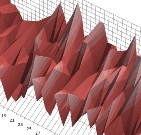
It's annoying to analyze a table of numbers, so I created some three dimensional graphs, starting with the daily data:

The daily resolution of this graph is too fine, but long periods of good surf or down periods can be identified. The longest period of inactivity due to conditions alone is early January of 2008. Other periods of inactivity are explained by inland vacations and the knee surgery.
Next, I created a surface graph of the monthly data for five years:

The darker colors represent fewer sessions, while the lighter colors represent more sessions. A trend of higher activity in the summer and fall can be identified, as well as high activity in April '06. The dips in August are the inland vacations, so that doesn't represent lack of surf. Some of the higher activity during the summer is due to more daylight hours, allowing for multiple sessions.
Finally, I reorganized the data to get weekly totals, and created another surface graph with somewhat finer resolution:

The same trends can be identified, and the weekly resolution is a good visual compromise.
Notes:
The highest daily total was three sessions, but I was conservative. For example, there were days when I surfed four contest heats and had a free surf, but I usually called two heats a single session.
The highest weekly total was 12 sessions in August '06.
The highest monthly total was 37 sessions in October '08.
The leap day session on 2/29/08 was added to 2/28/08 for simplification.
All images were created with Microsoft Excel. I bet dubstar has some map making tools that would make the surface graphs easier to read.